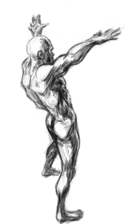
Thursday, May 16, 2013

prepping a new portfolio for 2013/2014

trying to get ready for portfolio in 2013- need to upgrade my storyboarding skills to match up with advertising agencies  for 2014 so i am trying to upgrade my portrait skills- here is my first try

what I need to do to improve by my initial assessment
1. work on my draftsmanship on copying gestures and portraits- the image is too messy
2. work on my selections for more refined coloring layout
3. work on finishing touches and highlights more effectively

Sunday, March 31, 2013

progressive with sketchbook pro 6

I am still trying to figure out how this software works.   I reviewed the youtube videos, and  figured out how to make a clean line.  One needs a good pencil brush and zooming up to 400%  and to practice sketching a clean line.  I am also seeing the blending tool sets. So I decided to do a work in progress...

This image is based off Will Eisner's character Antonio Tonatti from The Building graphic novella.  My first layer sketch was loosely made with a pencil tool.  The second clean up layer was made as stated earlier using a thinner pencil line and zooming up to 400%.  The third layer was made underneath the clean line using the paint brush tool at low opacity. Using several tones of a similar color, I can get a shadow and highlight look.  I then use blending tools also at low opacity and strength in order to blend colors and create some basic core shadows and cast shadows... My last layer goes on top of the line layer with a pencil tool at different colors to finish off the face  to look more rendered and remove the brown line in some areas or leave it as a different color when needed.... That's it! It was fun to try to do- I think the cartoony loose line look gives me more time for rendering to a more complete stage... I may think about this for comic production in the future- hmmm...

Thursday, January 10, 2013

ink-shade testing

I am trying to prepare for a an 8 page comic entry to a anthology.  The story I will illustrate features a girl with lots of dark hair. Therefore,  I decided to test my self trying to ink without the pen tool to see if I was steady enough for some details.  I decided I must start with a clean enough rough including hair contours. This rough was placed on the background layer- then I inked ( using a Wacom and photoshop) the dark line without using the pen tool which can be used for inking in digital comics- my focus was to see if I can  get close to getting a consistent line with my shaky hands.  Any loose lines were erased.
I treated hair on a separate layer since this is my weak point....  I approached this by coloring the hair completely in black and then erasing areas that corresponded to the rough hair contours.   I lowered the opacity of the hair layer so I could see the rough drawing underneath, during this process.  I looked at some anime style hair and how Terry Moore created hair for his characters in Strangers in Paradise as reference.
he flatting an shading process were done on layers beneath the line layer and above the background. I flatted whole areas of the skin and clothes. I could then use the selections in the flat layer to  contain shading and highlights placed on another layer..

That's it...- attached are the progressive steps in the animated gif

Friday, January 4, 2013

hands in pose

one of my instructors stated my hands were getting a little wonky- so I will be working on hand poses-- here is a sample

Thursday, January 3, 2013

comic-face-drawn-ink-shade

Okay I need to prepare for an upcoming comic segment for a Detroit Tradecraft anthology we are prepping for the Detroit Motor-City Convention. I did this progressive to show some progress.  My first assessment of this image is that I drew really tight so the inking and shading go more smoothly-I did not show preliminary drawings in order to focus on ink and paint process.  I will need to improve my shade process but that may have to be sorted on on the job... anyway- take a peak and comment... thanks-


Tuesday, December 25, 2012

looking at Youtube- color and overlay layers

I was watching you tube today and saw a way to color images that are rendered in black and white using a color and overlay layer at low opacity- so I decided to give it a try on this quick render-it works but as stated the render layer must be filled completely so it won't color spotty.
I still needs some work on my rendering but I got a sense of form- gotta keep working... enjoy sasquatch- will make the next one a progressive...

Thursday, December 20, 2012

just sketching

just sketching while listening to schoolism interview with william stout