Friday, July 10, 2015

playing with composite nodes/ Blender 2.75


I wanted to see if I could composite some image in Blender 2.75. I have mostly neglected this feature- being more familiar to non-linear applications like after affects or combustion. But Nodes are actually what all major applications use to compose pieces- So I wanted to take a crack at compositing  three images representing a foreground, mid-plane and a background. Using the mid plane and foreground element that have an alpha background- so they are more or less cutouts that can see around this was a good test// using Blender Node screen was cool- each image is an inputNode  that are composited together with Alpha Over  ( Color Node)- I wanted some 2d movement in the piece to give it a motion graphics feel- so a added a translate node after the foreground image Node and a rotation Node after the Mid plane image Node...
the node set up looks like this:
I will test this out with movie clips next... The movie can be then linked into the Video Sequence editor and synced with sound for a final output.....cool!

Saturday, July 4, 2015

movie test 1

This is a test 2d motion test using #Sketchbook Pro 7 images, #Blender 2.75 for frame by frame animation and #Audacity for sound tracking// the animation and sound we then edited together using Blenders Non linear video sequencer and output into OGV file format- this can be played on many browsers less Safari- I will need to figure how to align this into HTML5 features for mobile out put potential options....

Monday, March 30, 2015

last practice image

I decided to make a pledge to start my FX-mulrooney universe and portfolio for free-lance work instead of practicing- I decided to do one last practice art piece- recreating a comic panel- linework, color and copy- I used an piece created by Scott Lobdell and Chris Bachalo from"Generation Next" by Marvel Comics...
I created this image in Sketchbook Pro 7... I am thinking how to create the images of my Universe with this tool if my laptop doesn't crap out... I like the copic tools set of this version... It makes coloring easy and fun... so here is the last piece of the practice era....

I do note I am still a fan of Bachalo's style-its hard to duplicate and sweet

Tuesday, March 17, 2015

practicing with clean styles

The ultimate goal for my push in comics is to be able to be a better draftsman and simplify my style so i can do lots of it without burning out- so figuring out how other artists pose a character and handle rendering is a asset. So this is a test in copying the style from a great French cartoonist Felix Meynet... I found an image online  and went about trying to get the essence of the character and change it up a bit- I made an okay first approximation.... still need work on line weights, but not too shabby... You can find more of his published work on Brand Studio Press web site


Monday, February 23, 2015

pats inkover

I saw this cool Oliver Coipel pinup image of weapon X that another artist posted with his inked version and i decided to do my own to help me master the crazy crosshatch skills Oliver Coipel has- looks like I am failing miserably, but I will keep trying... I did this ink over digitally using Sketchbook pro 7... I felt I did better that I would have expected with this program. I was comfortable enough to ry to embellish more over than just copy.  Maybe if I keep it up I will have a shot at the pros some day- another practice image bites the dust

Monday, December 1, 2014

trace with bernie wrightson

Just trying to understand how these greats understand form by pure tracing over their work- this time I tried to trace over a Bernie Wrightson Solomon Grundy page. This was crazy on how detailed the work was- image it was 11X17 or larger- a lot of ink bottles were emptied on this piece.

I did this with Sketchbook pro 7- and was impressed with the response with the felt tip marker tool. this took me  a couple of hours to trace- image the time it took to ink this one with non digital tools- WOW- still impressed with this work...

My critique: I can tell I need to understand a curved stroke over a straight stroke and how those stroke define form- will keep working...

Monday, November 24, 2014

Tracing to crack the code- Neal Adams

was listing to interview with Neal Adams on Kevin Smith's Smodcast: Fatman on Batman and was inspired to learn many professionals use reference and maybe even tracing to increase there speed to complete artwork and  their production quality in some cases. Looking at Neal's stuff, I see a lot of reference but also an eye for art being exercised.. Noting he knows how to render shapes with a line and indicate depth like no other- so I am going back to school and tracing over his stuff to help me see how he sees in defining  and rendering his shapes- so I used sketchbook pro to produce this inking trace- I learn a lot about how he renders hair and volume.... more to come...

Thursday, July 25, 2013

value study crazy

I am thinking about doing value studies to  put into my portfolio- so I attempted this  figure drawing in sketchbook pro- just using the pencil tool for sketching the outline and the paint brush on medium opacity for the fill colors- I am trying to keep monochromatic so I can practice on identifying shapes with tone only... I determined that a clean line and great silhouette is the start for an impressive value study- well I have to get back to finishing the shading on my comic assignment of finishing pages for a writer in our comic group in preparation for Detroit Fan fare

Monday, July 15, 2013

a potential process for digital comics/black it out

I was trying to look a new quicker process fro creating images with photoshop without drawing them over many times- so I am testing out how to use layers, blending modes, opacity, levels, brush opacity, and brush flow.

So here goes the process:

first- set up a sketch brush- In zero layer or background//I use the square scatter brush at 25% opacity and 25% flow- so it may be a little gray- I generally put the brush size shape to 0% it will produce a gray underlying drawing- loose lines and all// I then use levels  and move black slider up till drawing gets lighter- redraw clean line concentrating on smooth quality- erase if necessary- the underlying drawing is now done- for longer curves strokes- we can use the pen tool and brush stroke- vary brush size when needed...

second step- in above layer- set on multiply// increase brush size and lower opacity to <15%  and low flow for use this as a rendering  or shading layer- concentrate on shading core shadows and cast only- you can erase with low flow and opacity as well to make less drastic in tone....

third layer- in above layer- the black out layer- here we just color in black/ leave in normal blend mode - this can be used as both  a mask selection and a solid  upper background layer for the top color layer- set brush to 100% opacity and flow- we can use this as a mask by selecting the area outside the mask if colored in and choose inverse or select the black colored are if well defined...set this layer as 10-15% opacity- this will allow color to be seen from top layer

fourth and final layer-set to color mode- with the mask intact- fill in a skin or other area of color- with solid color... this also can be altered by erasing at low opacity and flow and adding color with a hard bush to identify textures

so thats it- hopefully this will make creating a page systematic and cool looking


Tuesday, June 11, 2013

tuesday morning sketch

just wanted to do a sketch in sketchbook pro. I figured I would change this up- identify outlines, then add shading in broad strokes and tones , then identify detail last- I always get caught up with details too soon in drawing and then it looks either overworked or not well planned.... so hopefully this tactic works in future drawings....
noted indirect or bounce light is not identified under the chin. So hopefully the following fixes the issue
the last step should be to look at the occlusion or mostlydark areas- this will be in creases that recieve no light- this adds more pop  to the character


Thursday, May 16, 2013

prepping a new portfolio for 2013/2014

trying to get ready for portfolio in 2013- need to upgrade my storyboarding skills to match up with advertising agencies  for 2014 so i am trying to upgrade my portrait skills- here is my first try

what I need to do to improve by my initial assessment
1. work on my draftsmanship on copying gestures and portraits- the image is too messy
2. work on my selections for more refined coloring layout
3. work on finishing touches and highlights more effectively

Sunday, March 31, 2013

progressive with sketchbook pro 6

I am still trying to figure out how this software works.   I reviewed the youtube videos, and  figured out how to make a clean line.  One needs a good pencil brush and zooming up to 400%  and to practice sketching a clean line.  I am also seeing the blending tool sets. So I decided to do a work in progress...

This image is based off Will Eisner's character Antonio Tonatti from The Building graphic novella.  My first layer sketch was loosely made with a pencil tool.  The second clean up layer was made as stated earlier using a thinner pencil line and zooming up to 400%.  The third layer was made underneath the clean line using the paint brush tool at low opacity. Using several tones of a similar color, I can get a shadow and highlight look.  I then use blending tools also at low opacity and strength in order to blend colors and create some basic core shadows and cast shadows... My last layer goes on top of the line layer with a pencil tool at different colors to finish off the face  to look more rendered and remove the brown line in some areas or leave it as a different color when needed.... That's it! It was fun to try to do- I think the cartoony loose line look gives me more time for rendering to a more complete stage... I may think about this for comic production in the future- hmmm...

Thursday, January 10, 2013

ink-shade testing

I am trying to prepare for a an 8 page comic entry to a anthology.  The story I will illustrate features a girl with lots of dark hair. Therefore,  I decided to test my self trying to ink without the pen tool to see if I was steady enough for some details.  I decided I must start with a clean enough rough including hair contours. This rough was placed on the background layer- then I inked ( using a Wacom and photoshop) the dark line without using the pen tool which can be used for inking in digital comics- my focus was to see if I can  get close to getting a consistent line with my shaky hands.  Any loose lines were erased.
I treated hair on a separate layer since this is my weak point....  I approached this by coloring the hair completely in black and then erasing areas that corresponded to the rough hair contours.   I lowered the opacity of the hair layer so I could see the rough drawing underneath, during this process.  I looked at some anime style hair and how Terry Moore created hair for his characters in Strangers in Paradise as reference.
he flatting an shading process were done on layers beneath the line layer and above the background. I flatted whole areas of the skin and clothes. I could then use the selections in the flat layer to  contain shading and highlights placed on another layer..

That's it...- attached are the progressive steps in the animated gif

Friday, January 4, 2013

hands in pose

one of my instructors stated my hands were getting a little wonky- so I will be working on hand poses-- here is a sample

Thursday, January 3, 2013

comic-face-drawn-ink-shade

Okay I need to prepare for an upcoming comic segment for a Detroit Tradecraft anthology we are prepping for the Detroit Motor-City Convention. I did this progressive to show some progress.  My first assessment of this image is that I drew really tight so the inking and shading go more smoothly-I did not show preliminary drawings in order to focus on ink and paint process.  I will need to improve my shade process but that may have to be sorted on on the job... anyway- take a peak and comment... thanks-


Tuesday, December 25, 2012

looking at Youtube- color and overlay layers

I was watching you tube today and saw a way to color images that are rendered in black and white using a color and overlay layer at low opacity- so I decided to give it a try on this quick render-it works but as stated the render layer must be filled completely so it won't color spotty.
I still needs some work on my rendering but I got a sense of form- gotta keep working... enjoy sasquatch- will make the next one a progressive...

Thursday, December 20, 2012

just sketching

just sketching while listening to schoolism interview with william stout

Friday, December 7, 2012

color composition- face progression


Okay, I was racking my brain to determine a way to put out color compositions with clean enough lines and rendered colors adequate enough for presentation storyboards. I looked on several websites of working storyboard artists.   Some were really sweet, with nation-wide contacts and references and some were not  so sweet but consistent and clean.   In other words, art varies greatly from person to person.  I figured out, then and there, that I needed to devise a method for me that works with my style and will be considered world class... Sweet,clean, and consistent.... The following progressive is my first attempt at getting this look- step1: create non-white background-2 Sketch a face loosely and do feathering as needed to identify planes of the face that will be rendered in color- 3 tighten up features that will be described as line later- ie not all cross-hatching should be tightened up- the idea is less lines are more- 4 -finish line in black  (100% opacity, 100% flow)- idea is economy of lines-5 create a color render for the face- effectively I selected the face alone and use big brush strokes  ( at low flow) for main tint and shadow-highlights were done with smaller brush- following the crosshatched lines denoting the planes of the face. 6 placed hair on the image ( this I still need to work on but the idea was work with 2-3 colors for the hair. 7 the last stage is hide sketch layers for finished look

Sunday, December 2, 2012

anatomy-sketch- mistake check

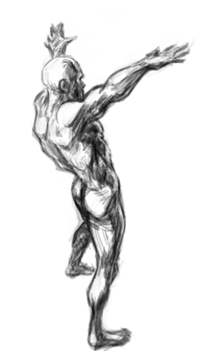
As stated earlier I have some size issue i have to work out- as can be seen in the animated gif of two alternating images on a nude i did yesterday- sorry yes nude- aside for the nudity you get the drift of areas i need more practice in- I will be going through a couple of anatomy landmark studies to hopefully eliminate this issue...

anatomy sketch 1 progressive- up to clean up contour

I was finding out my characters were looking a little wonky- such that if i were to try and finish them at a their current stage- they would look skewed, or out of proportioned- i was told by one of my instructors- I have a size problem- hands and feet and head would be too large or make my perspective ambiguous or feel flat. so  using photoshop I have found out i can correct my feature size issue but it would take me more than one or two tries- ie with modification I kept getting better- I just need to determine when good enough and time constraint merge and go with that- here is my first anatomy progressive- as you can tell features change and morph as I refine- I am still trying to use the methods Loomis lays down in his books